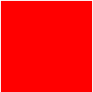
一共收集整理了图形20个,比较实用,同时也为了熟悉CSS的代码。整合了一下,有错误欢迎指出。 1.正方形
#square {width: 100px;height: 100px;background: red;}
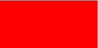
2.长方形
#rectangle {width: 200px;height: 100px;background: red;}
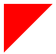
3.左上三角
#triangle-topleft {width: 0;height: 0;border-top: 100px solid red; border-right: 100px solid transparent;}
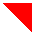
4.右上三角
#triangle-topright {width: 0;height: 0;border-top: 100px solid red; border-left: 100px solid transparent;}
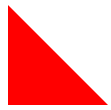
5.左下三角
#triangle-bottomleft {width: 0;height: 0;border-bottom: 100px solid red; border-right: 100px solid transparent;}
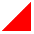
6.右下三角
#triangle-bottomright {width: 0;height: 0;border-bottom: 100px solid red; border-left: 100px solid transparent;}
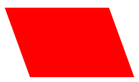
7.平行四边形
#parallelogram {width: 150px;height: 100px;-webkit-transform: skew(20deg); -moz-transform: skew(20deg); -o-transform: skew(20deg);background: red;}
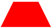
8.梯形
#trapezoid {border-bottom: 100px solid red;border-left: 50px solid transparent;border-right: 50px solid transparent;height: 0;width: 100px;}
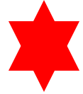
9.六角星
#star-six {width: 0;height: 0;border-left: 50px solid transparent;border-right: 50px solid transparent;border-bottom: 100px solid red;position: relative;}#star-six:after {width: 0;height: 0;border-left: 50px solid transparent;border-right: 50px solid transparent;border-top: 100px solid red;position: absolute;content: "";top: 30px;left: -50px;}
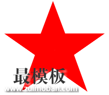
10.五角星
#star-five { margin: 50px 0; position: relative; display: block; color: red; width: 0px; height: 0px; border-right: 100px solid transparent; border-bottom: 70px solid red; border-left: 100px solid transparent; -moz-transform: rotate(35deg); -webkit-transform: rotate(35deg); -ms-transform: rotate(35deg); -o-transform: rotate(35deg);}#star-five:before { border-bottom: 80px solid red; border-left: 30px solid transparent; border-right: 30px solid transparent; position: absolute; height: 0; width: 0; top: -45px; left: -65px; display: block; content: ''; -webkit-transform: rotate(-35deg); -moz-transform: rotate(-35deg); -ms-transform: rotate(-35deg); -o-transform: rotate(-35deg); }#star-five:after { position: absolute; display: block; color: red; top: 3px; left: -105px; width: 0px; height: 0px; border-right: 100px solid transparent; border-bottom: 70px solid red; border-left: 100px solid transparent; -webkit-transform: rotate(-70deg); -moz-transform: rotate(-70deg); -ms-transform: rotate(-70deg); -o-transform: rotate(-70deg); content: '';}
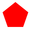
11.五边形
#pentagon { position: relative; width: 54px; border-width: 50px 18px 0; border-style: solid; border-color: red transparent;}#pentagon:before { content: ""; position: absolute; height: 0; width: 0; top: -85px; left: -18px; border-width: 0 45px 35px; border-style: solid; border-color: transparent transparent red;}
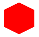
12.六边形
#hexagon {width: 100px;height: 55px;background: red;position: relative;}#hexagon:before {content: "";position: absolute;top: -25px; left: 0;width: 0;height: 0;border-left: 50px solid transparent;border-right: 50px solid transparent;border-bottom: 25px solid red;}#hexagon:after {content: "";position: absolute;bottom: -25px; left: 0;width: 0;height: 0;border-left: 50px solid transparent;border-right: 50px solid transparent;border-top: 25px solid red;}
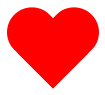
13.桃心
#heart { position: relative; width: 100px; height: 90px;}#heart:before,#heart:after { position: absolute; content: ""; left: 50px; top: 0; width: 50px; height: 80px; background: red; -moz-border-radius: 50px 50px 0 0; border-radius: 50px 50px 0 0; -webkit-transform: rotate(-45deg); -moz-transform: rotate(-45deg); -ms-transform: rotate(-45deg); -o-transform: rotate(-45deg); transform: rotate(-45deg); -webkit-transform-origin: 0 100%; -moz-transform-origin: 0 100%; -ms-transform-origin: 0 100%; -o-transform-origin: 0 100%; transform-origin: 0 100%;}#heart:after { left: 0; -webkit-transform: rotate(45deg); -moz-transform: rotate(45deg); -ms-transform: rotate(45deg); -o-transform: rotate(45deg); transform: rotate(45deg); -webkit-transform-origin: 100% 100%; -moz-transform-origin: 100% 100%; -ms-transform-origin: 100% 100%; -o-transform-origin: 100% 100%; transform-origin :100% 100%;}
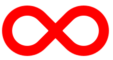
14.无限大符号
#infinity { position: relative; width: 212px; height: 100px;} #infinity:before,#infinity:after { content: ""; position: absolute; top: 0; left: 0; width: 60px; height: 60px; border: 20px solid red; -moz-border-radius: 50px 50px 0 50px; border-radius: 50px 50px 0 50px; -webkit-transform: rotate(-45deg); -moz-transform: rotate(-45deg); -ms-transform: rotate(-45deg); -o-transform: rotate(-45deg); transform: rotate(-45deg);} #infinity:after { left: auto; right: 0; -moz-border-radius: 50px 50px 50px 0; border-radius: 50px 50px 50px 0; -webkit-transform: rotate(45deg); -moz-transform: rotate(45deg); -ms-transform: rotate(45deg); -o-transform: rotate(45deg); transform: rotate(45deg);}
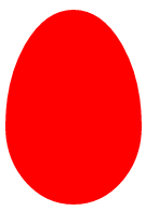
15.蛋
#egg { display:block; width: 126px; height: 180px; background-color: red; -webkit-border-radius: 63px 63px 63px 63px / 108px 108px 72px 72px; border-radius: 50% 50% 50% 50% / 60% 60% 40% 40%;}
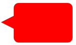
16.提示对话框
#talkbubble { width: 120px; height: 80px; background: red; position: relative; -moz-border-radius: 10px; -webkit-border-radius: 10px; border-radius: 10px;}#talkbubble:before { content:""; position: absolute; right: 100%; top: 26px; width: 0; height: 0; border-top: 13px solid transparent; border-right: 26px solid red; border-bottom: 13px solid transparent;}
17.十二角星
#burst-8 { background: red; width: 80px; height: 80px; position: relative; text-align: center; -webkit-transform: rotate(20deg); -moz-transform: rotate(20deg); -ms-transform: rotate(20deg); -o-transform: rotate(20eg); transform: rotate(20deg);}#burst-8:before { content: ""; position: absolute; top: 0; left: 0; height: 80px; width: 80px; background: red; -webkit-transform: rotate(135deg); -moz-transform: rotate(135deg); -ms-transform: rotate(135deg); -o-transform: rotate(135deg); transform: rotate(135deg);}
18.八角星
#burst-8 { background: red; width: 80px; height: 80px; position: relative; text-align: center; -webkit-transform: rotate(20deg); -moz-transform: rotate(20deg); -ms-transform: rotate(20deg); -o-transform: rotate(20eg); transform: rotate(20deg);}#burst-8:before { content: ""; position: absolute; top: 0; left: 0; height: 80px; width: 80px; background: red; -webkit-transform: rotate(135deg); -moz-transform: rotate(135deg); -ms-transform: rotate(135deg); -o-transform: rotate(135deg); transform: rotate(135deg);}
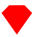
19.钻石
#cut-diamond { border-style: solid; border-color: transparent transparent red transparent; border-width: 0 25px 25px 25px; height: 0; width: 50px; position: relative; margin: 20px 0 50px 0;}#cut-diamond:after { content: ""; position: absolute; top: 25px; left: -25px; width: 0; height: 0; border-style: solid; border-color: red transparent transparent transparent; border-width: 70px 50px 0 50px;}
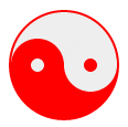
20.八卦
#yin-yang {width: 96px;height: 48px;background: #eee;border-color: red;border-style: solid;border-width: 2px 2px 50px 2px;border-radius: 100%;position: relative;}#yin-yang:before {content: "";position: absolute;top: 50%;left: 0;background: #eee;border: 18px solid red;border-radius: 100%;width: 12px;height: 12px;}#yin-yang:after {content: "";position: absolute;top: 50%;left: 50%;background: red;border: 18px solid #eee;border-radius:100%;width: 12px;height: 12px;}
(责任编辑:最模板) |
用CSS代码写出的各种形状图形的方法
时间:2016-03-17 16:22来源:未知 作者:最模板 点击:次
一共收集整理了图形20个,比较实用,同时也为了熟悉CSS的代码。整合了一下,有错误欢迎指出。 1.正方形 #square {width: 100px;height: 100px;background: red;} 2.长方形 #rectangle {width: 200px;height:


顶一下
(4)
100%
踩一下
(0)
0%
------分隔线----------------------------
- 上一篇:怎样用CSS做出3D效果的云
- 下一篇:HTML DOM status 属性
- 热点内容
-
- CSS居中最详细教程
家总是会抱怨如何在CSS中居中一个元素。为什么会这么难呢?呵...
- 怎样用CSS做出3D效果的云
本文将介绍如何一步一步制作出一些3D效果的云彩,会用到一些...
- 浏览器Lexer与XSS-HTML编码
浏览器Lexer与XSS-HTML编码问题一直是一个痛点,在wooyun有一篇XS...
- JavaScript API 设计原则
好的 API 设计:在自描述的同时,达到抽象的目标。 设计良好的...
- 深入理解CSS过渡transition
通过过渡transition,可以让web前端开发人员不需要javascript就可以...
- CSS居中最详细教程
- 随机模板
-
-
 shopex仿银泰商城模板
人气:783
shopex仿银泰商城模板
人气:783
-
 ecshop仿米奇网化妆品2014网
人气:549
ecshop仿米奇网化妆品2014网
人气:549
-
 Venedor经济型外贸服饰mag
人气:128
Venedor经济型外贸服饰mag
人气:128
-
 SuperShop跨境电子商务多用
人气:451
SuperShop跨境电子商务多用
人气:451
-
 ecshop仿m18麦考林2012版模板
人气:1009
ecshop仿m18麦考林2012版模板
人气:1009
-
 简洁asp服务型企业网站源
人气:669
简洁asp服务型企业网站源
人气:669
-